Client Tryginsurance. Activity UX, Design & Digital Identity. Website www.tryg.dk
Client Tryginsurance. Activity UX, Design & Digital Identity. Website www.tryg.dk
Client Tryginsurance. Activity UX, Design & Digital Identity. Website www.tryg.dk
Client Tryginsurance. Activity UX, Design & Digital Identity. Website www.tryg.dk
Client Tryginsurance. Activity UX, Design & Digital Identity. Website www.tryg.dk
Insurance in a simple way.
Insurance in a simple way.
Insurance in a simple way.
Insurance in a simple way.
Insurance in a simple way.
Most of the time it is difficult to communication the benefits of a complex product and people do not appreciate until they need it. When products and prices are similar in the industry - a great customer experience becomes a top priority when selecting an insurance company. Together with Tryg we developed a new digital platform and created a new and modern website. The key strategy was to make customers feel in a warm and safe environment where complex products were explained in an eye to eye level and with a user centric communication. Through a long term agile collaboration with Tryg we co-created a new digital platform with a large scaled design system that would give a consistent appearance across platforms. The agile process gave us huge insights quickly and it made the decision making process less complex.
Most of the time it is difficult to communication the benefits of a complex product and people do not appreciate until they need it. When products and prices are similar in the industry - a great customer experience becomes a top priority when selecting an insurance company. Together with Tryg we developed a new digital platform and created a new and modern website. The key strategy was to make customers feel in a warm and safe environment where complex products were explained in an eye to eye level and with a user centric communication. Through a long term agile collaboration with Tryg we co-created a new digital platform with a large scaled design system that would give a consistent appearance across platforms. The agile process gave us huge insights quickly and it made the decision making process less complex.
Most of the time it is difficult to communication the benefits of a complex product and people do not appreciate until they need it. When products and prices are similar in the industry - a great customer experience becomes a top priority when selecting an insurance company. Together with Tryg we developed a new digital platform and created a new and modern website. The key strategy was to make customers feel in a warm and safe environment where complex products were explained in an eye to eye level and with a user centric communication. Through a long term agile collaboration with Tryg we co-created a new digital platform with a large scaled design system that would give a consistent appearance across platforms. The agile process gave us huge insights quickly and it made the decision making process less complex.
Most of the time it is difficult to communication the benefits of a complex product and people do not appreciate until they need it. When products and prices are similar in the industry - a great customer experience becomes a top priority when selecting an insurance company. Together with Tryg we developed a new digital platform and created a new and modern website. The key strategy was to make customers feel in a warm and safe environment where complex products were explained in an eye to eye level and with a user centric communication. Through a long term agile collaboration with Tryg we co-created a new digital platform with a large scaled design system that would give a consistent appearance across platforms. The agile process gave us huge insights quickly and it made the decision making process less complex.
Most of the time it is difficult to communication the benefits of a complex product and people do not appreciate until they need it. When products and prices are similar in the industry - a great customer experience becomes a top priority when selecting an insurance company. Together with Tryg we developed a new digital platform and created a new and modern website. The key strategy was to make customers feel in a warm and safe environment where complex products were explained in an eye to eye level and with a user centric communication. Through a long term agile collaboration with Tryg we co-created a new digital platform with a large scaled design system that would give a consistent appearance across platforms. The agile process gave us huge insights quickly and it made the decision making process less complex.
Key findings.
Key findings.
Key findings.
Key findings.
Key findings.
Guidance and Simplicity - Simplicity is key to a good user experience across platforms. Sharp priorities and a clear overview will guide the users and help them in their needs. The focus should be on quality instead of quantity. Consistency and break down silos - We are one brand and the customers should have a consistent experience across platforms. Transitions and interactive elements should reduce the customers cognitive load and guide them to a better decision in the end. Trust - We are all humans - We need to accommodate the customers in every situation therefore we need to guide the single user through transparency. We are transparent and straight to the point through communication - the good relationship with the users should happen through trust and not hidden prices. Leads - Insure high value leads to lower costs in the support department.
Guidance and Simplicity - Simplicity is key to a good user experience across platforms. Sharp priorities and a clear overview will guide the users and help them in their needs. The focus should be on quality instead of quantity. Consistency and break down silos - We are one brand and the customers should have a consistent experience across platforms. Transitions and interactive elements should reduce the customers cognitive load and guide them to a better decision in the end. Trust - We are all humans - We need to accommodate the customers in every situation therefore we need to guide the single user through transparency. We are transparent and straight to the point through communication - the good relationship with the users should happen through trust and not hidden prices. Leads - Insure high value leads to lower costs in the support department.
Guidance and Simplicity - Simplicity is key to a good user experience across platforms. Sharp priorities and a clear overview will guide the users and help them in their needs. The focus should be on quality instead of quantity. Consistency and break down silos - We are one brand and the customers should have a consistent experience across platforms. Transitions and interactive elements should reduce the customers cognitive load and guide them to a better decision in the end. Trust - We are all humans - We need to accommodate the customers in every situation therefore we need to guide the single user through transparency. We are transparent and straight to the point through communication - the good relationship with the users should happen through trust and not hidden prices. Leads - Insure high value leads to lower costs in the support department.
Guidance and Simplicity - Simplicity is key to a good user experience across platforms. Sharp priorities and a clear overview will guide the users and help them in their needs. The focus should be on quality instead of quantity. Consistency and break down silos - We are one brand and the customers should have a consistent experience across platforms. Transitions and interactive elements should reduce the customers cognitive load and guide them to a better decision in the end. Trust - We are all humans - We need to accommodate the customers in every situation therefore we need to guide the single user through transparency. We are transparent and straight to the point through communication - the good relationship with the users should happen through trust and not hidden prices. Leads - Insure high value leads to lower costs in the support department.
Guidance and Simplicity - Simplicity is key to a good user experience across platforms. Sharp priorities and a clear overview will guide the users and help them in their needs. The focus should be on quality instead of quantity. Consistency and break down silos - We are one brand and the customers should have a consistent experience across platforms. Transitions and interactive elements should reduce the customers cognitive load and guide them to a better decision in the end. Trust - We are all humans - We need to accommodate the customers in every situation therefore we need to guide the single user through transparency. We are transparent and straight to the point through communication - the good relationship with the users should happen through trust and not hidden prices. Leads - Insure high value leads to lower costs in the support department.


Design concept.
Design concept.
Design concept.
Design concept.
Design concept.
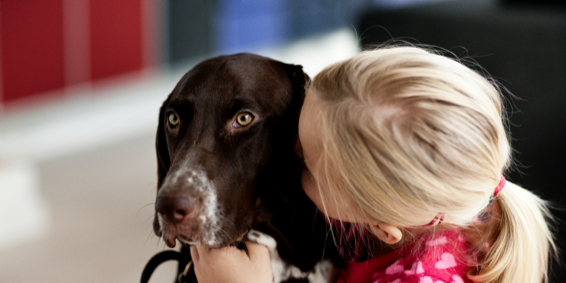
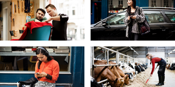
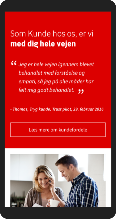
The design concept is build upon understanding the audience situation and be accommodating. Therefore, we put images and big headlines in focus to establish a bond through emotions - we talk in an eye to eye level to the audience so they feel in a warm and safe environment.
The interface is made simple to enhance the audience focus to the informative site, actions and symbols guide the user in their journey towards understanding a product or find the help or information they need. This is done with minimal colour usage and a decent amount of whitespace - to create a perfect balance between text, images and actions and not give the audience a cognitive overload.
In order to distinguish the design from other competitives and give the audience a modern feeling - we worked with a dynamic layout where we break the classic block layout with a subtle background that gives a more dynamic experience as you explore the site.
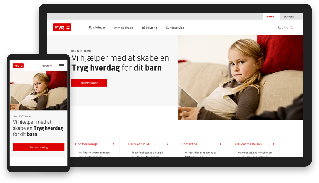
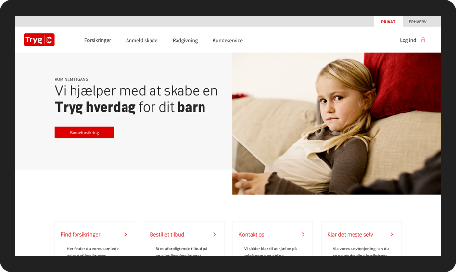
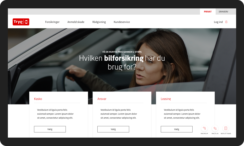
FRONTPAGE
FRONTPAGE
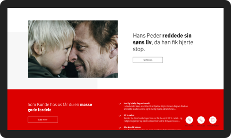
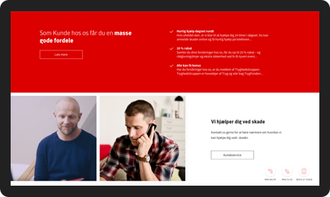
DETAILS OF FRONTPAGE
DETAILS OF FRONTPAGE
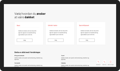
PRODUCTPAGE
PRODUCTPAGE
DETAILS OF PRODUCT
DETAILS OF PRODUCT
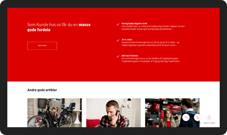
BRANDING AREA
BRANDING AREA
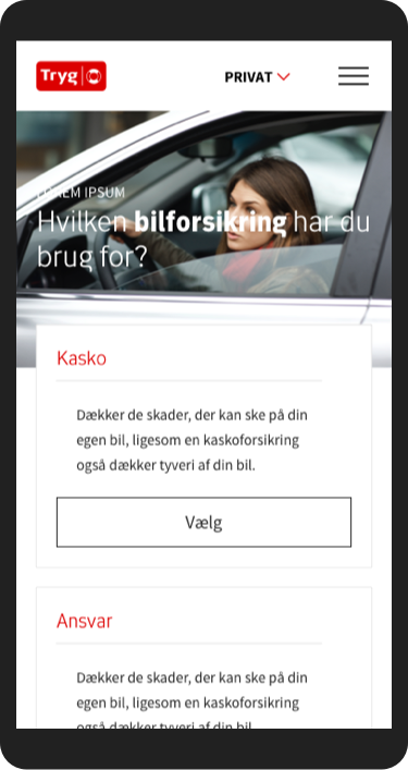
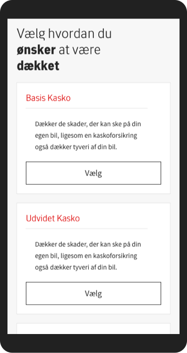
PRODUCTPAGE MOBILE
PRODUCTPAGE MOBILE
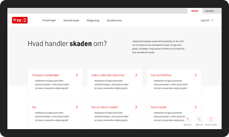
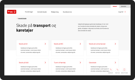
NAVIGATIONPAGE
NAVIGATIONPAGE
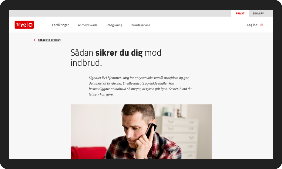
ARTICLE PAGE
ARTICLE PAGE
ARTICLE PAGE
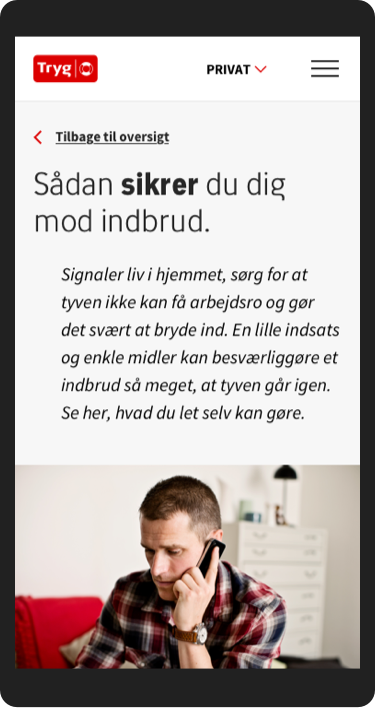
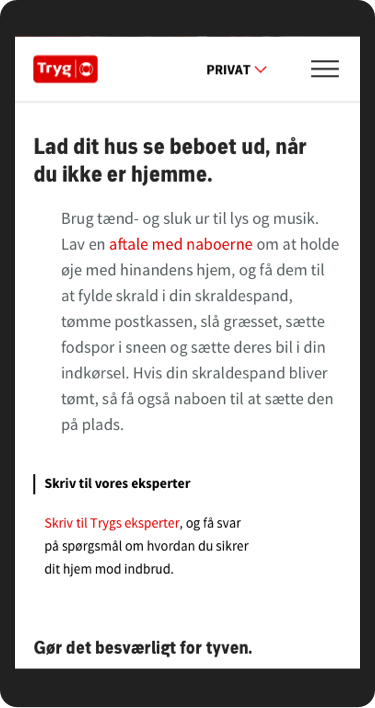
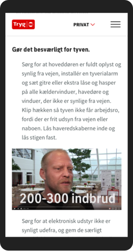
ARTICLE PAGE MOBILE
ARTICLE PAGE MOBILE
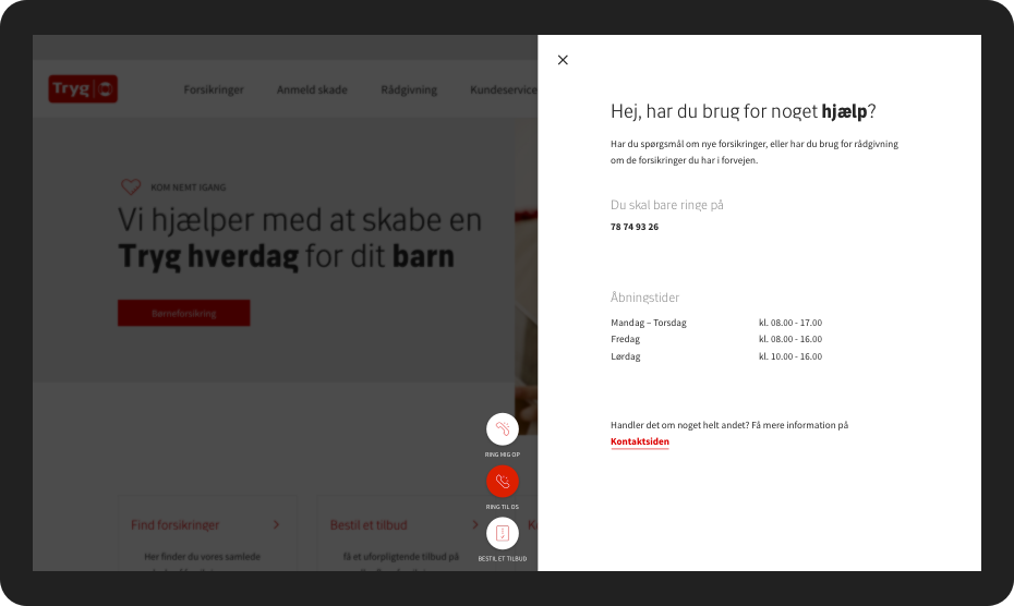
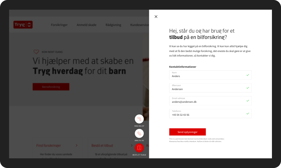
CONTACT
CONTACT
CONTACT
CONTACT
CONTACT
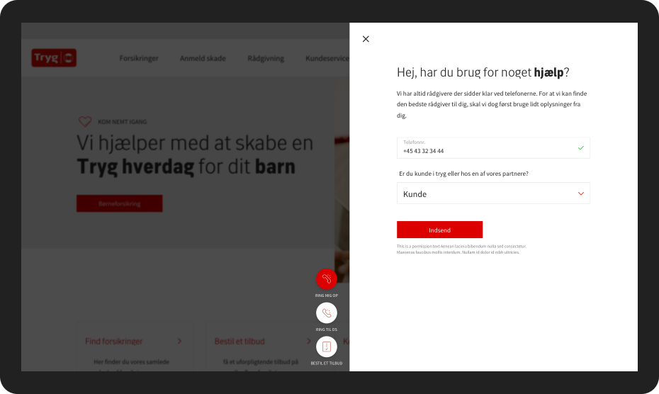
CONTACT
CONTACT
CONTACT
CONTACT
CONTACT